Do we really need to create a brand identity?
As someone who has worked in marketing communications for over a decade, I knew establishing a brand identity for ourselves would be important in helping us focus and present a consistent image and tone. With Steve and I co-writing the blog as well as creating our social media content and maintaining our website together, having clear guidelines helps us confidently move forward publishing content without constantly feeling like we need to check in with the other person. It’s true that boundaries actually do allow for greater creativity and expression. So where to start…
The Brand Development Process
Almost a year ago we hosted my high school friend’s bachelorette weekend in Colorado (so I could attend 37 weeks pregnant!) and I had a chance to really reconnect with my friend Caitlin Loos. She and I have kept in touch via Facebook and texts along with our nearly annual meet-up during trips home to Portland to visit my family. She’s been doing creative design work in various capacities since we graduated and it’s been fun to watch her navigate working for organizations, freelancing and ultimately staying true to who she is and the things she cares about. While we were hiking outside of Nederland, CO she summed it up well by saying she was at a point in her career where she wanted to work on projects she was passionate enough about that she would do it for free. As the weekend continued I shared our vision for the Forbes Family Farm and as she left to return to Portland she said I should take her up on the offer to do our brand identity work whenever we were ready to pursue our dream.
Fast forward six months and I announced my resignation to my staff, started our website and began moving forward in this journey in earnest. I reached out to Caitlin to see if she might have time to help us create a logo to get started. She went above and beyond to really hear our story in order to capture the essence of who we are and what we’re doing in not just our logo, but how we present ourselves as a brand. We’ve had several great conversations on the phone and over email (although the most recent call had to be delayed because we were out trying to herd our new runner ducks into their house). Flexibility is key. 🙂
To give you a behind the scenes look at how things have evolved, we sat down with Caitlin for a little Q&A:
Q: It has been a long journey since we started our brand identity work with you! When we first approached you about the project, what were your initial thoughts?
Emily has been my dear friend for nearly two decades, and I have had the pleasure to get to know Steve and the whole Forbes family in that time, so when I found out about your new endeavor, I was so so happy for your next adventure, I was so ecstatic to be able to help you tell your story through your brand identity.
Early on in this project, it was clear that you had a strong identity and really knew who you wanted to be, as a business and as a burgeoning brand. The values you established – family, community, education, wellness, and quality – clearly needed to be foundational elements of your brand story, and my job was to help bring your story to life.
Q: It was such an interesting process to develop our brand together. Can you describe the steps you took with us?
The first step in our work together was for me to ask a lot of questions and do a lot of listening about what your brand was all about. This spanned from the very tactical – what will your business do? – to the more abstract – what newspaper headline printed about your business a year from now would make you most proud? It was important to really understand your vision for the brand, what differentiated The Forbes Family Farm, and what elements would really help you to tell your story in a way that would resonate and build awareness with the audience you are trying to reach.
For The Forbes Family Farm, there was so much heart, love, and thoughtfulness in the foundation of the business, there was a ton to draw from. After absorbing all of the information and doing a bit of research, I came up with two different approaches represented in the form of mood boards. It was important for me to gauge what resonated and what didn’t.
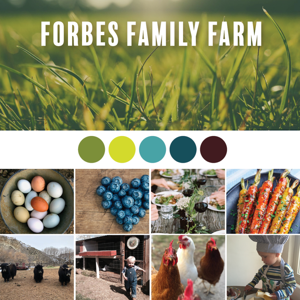
The first mood board is a modern and stoic approach to the brand. It is polished and rustic, and the gaze is very intentional and planned. It is restrained and minimalist, and the imagery is more ambient than descriptive, creating the ideal environment and platform for your message.
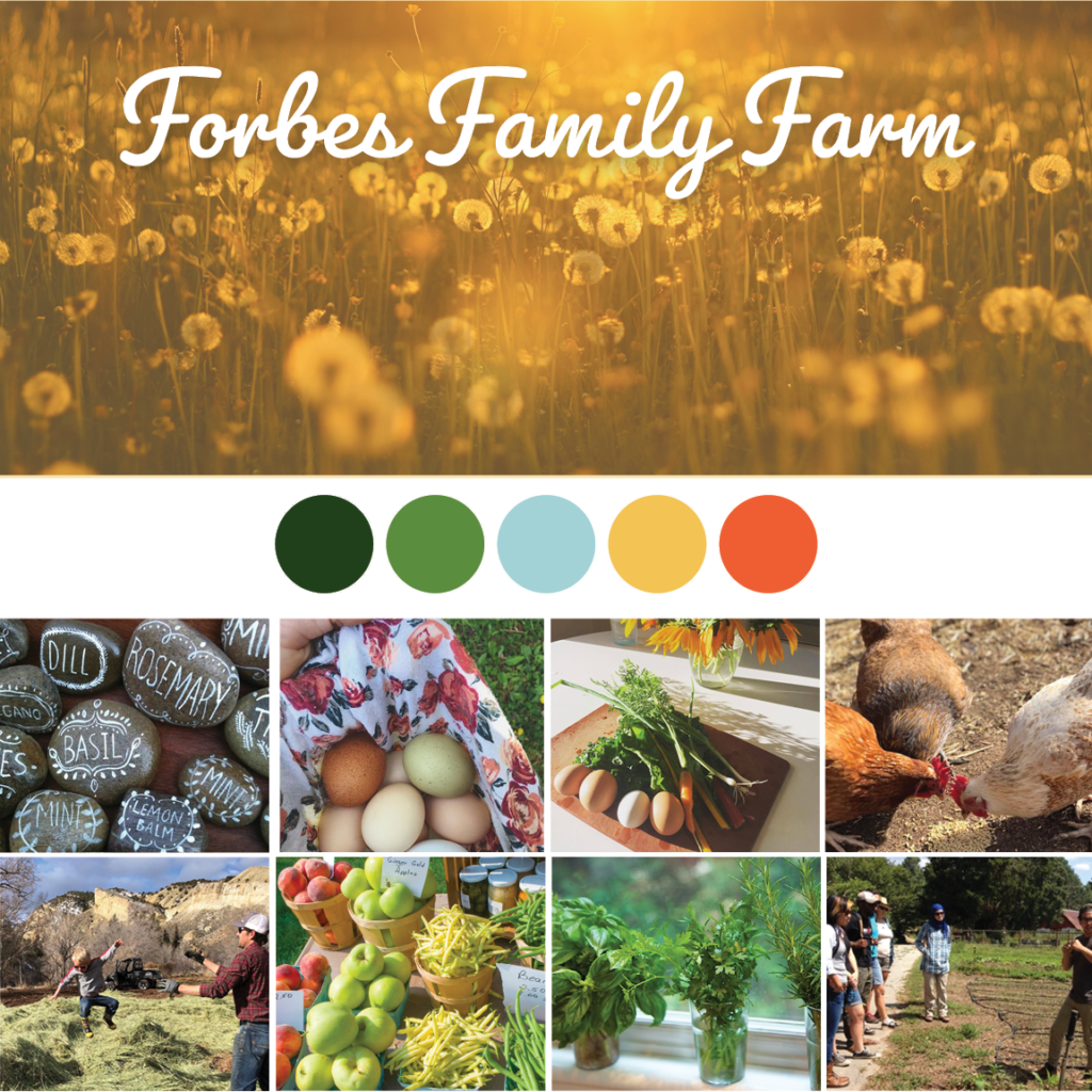
The second mood board offered an alternative perspective and is warm and familiar. It is real and a bit unbuttoned, and the audience can easily see themselves in the brand. It is organic and bright and folksy, and the imagery is more descriptive, showing, in addition to telling your stories.
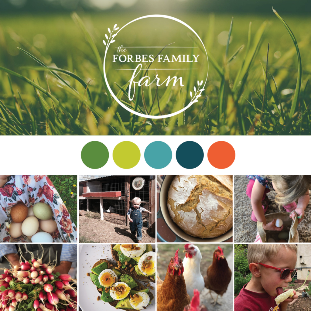
The feedback I got from this phase of the project was critical to the next stage – creating the logo and refining the identity elements.
Q: We love the meaning built into the logo that we landed on. Can you explain it?
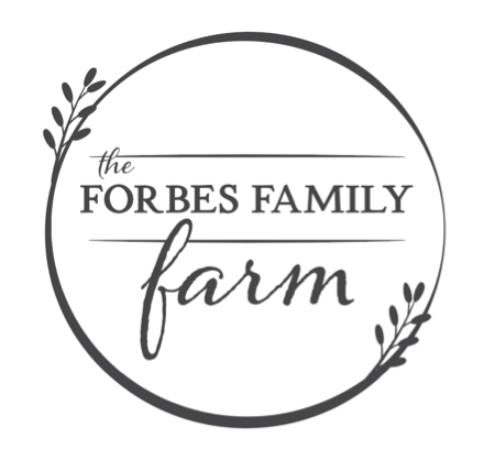
Yes! The logo represents that The Forbes Family Farm allows its audience a window into an intimate world of home, farm and education. The circle form captures this glimpse. Throughout the logo are unconstrained shapes that are solid and strong, while playful. The growing plants grow both into the farm world and outside, as you are planting seeds, literal and beyond, for your family and your community. The logo is approachable yet refined to match the brand style.
Q: What are some of the other elements of The Forbes Family Farm visual identity?
Some of the components that round out the visual identity are:
- Color: Rooted in colors of the earth. The primary green hue is vibrant and modern, and it is accented by a selection of balanced warm and cool highlights.
- Typography: Optimistic and grounded, with an approachable, yet disciplined, energy.
- Photography composition: Intimate, close in compositions that invite your audience into the small moments in your lives. Use shallow depth of field to focus on these moments while showing the expanse and breathing room that surrounds them.
- Flat lay image style: Shot from above and showing scenes from life in a way that is intentionally rustic and only minimally curated. This style invites viewers in to imagine themselves in the scene, and it is a perfect fit for the inviting and authentic brand.
As a growing business and brand, we will build on these identity elements in the future including package design, signage, messaging, and whatever else is needed to round out the brand toolkit.
Q: What were the highs and lows of working on this project from your perspective?
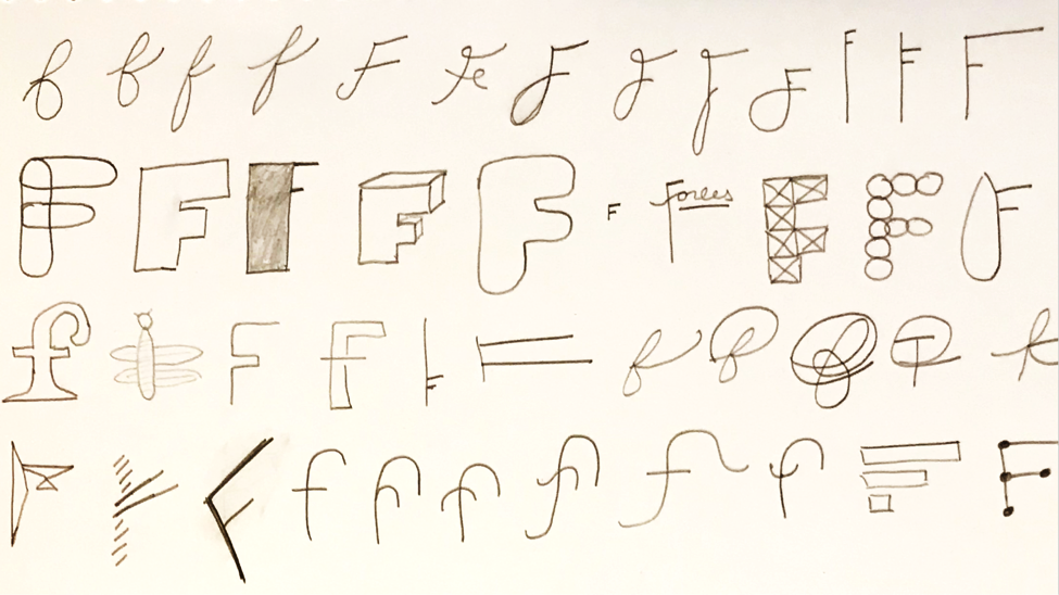
The low for me in brand projects is nearly always the same – getting stuck. Getting past stuck is a critical part of any creative endeavor, and this project was no exception. After my initial brainstorms and some promising early ideas, I got stuck on representational elements of the logo. So I created a lot of F’s….in hopes that the exercise would unstick my brain. Happily, it worked, and this process sparked a seed of an idea that eventually turned into early iterations of the logo!
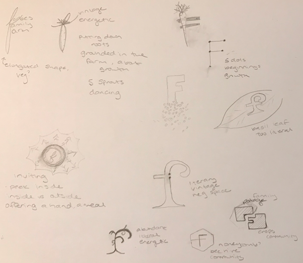
There have been lots of highs in this project, but I think my favorite was hearing the energy, excitement and amazing plan Emily and Steve had heading into this business. Brand identity is important, but living the brand and creating the story is the really hard work, and it is such a delight to watch the Forbes family doing those things in spades through this endeavor!
Where do we go from here?
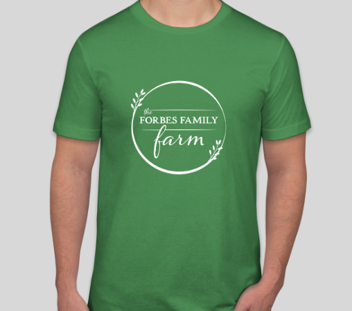
We’re excited to start rolling out the various elements of our brand identity over the coming months. You’ll notice the logo on our site already and in our spare moments of time we’re working on fonts, colors and styles. Once the harvest season is over we’ll have a little more time to devote to our online presence! We also just ordered our first batch of farm shirts and have business cards on their way. It’s beginning to feel a little more real.



I can see this lovely logo on canvas bags filled with logo-stickered homemade jams, logo-labeled compostable containers filled with FFF produce with logo-stamped hand written receipts. And on aprons, your welcome mats, directional signs to the B&B…Love it.
Yes indeed! You’re giving me some more good ideas. 🙂